MUJI Website Redesign
Overview:
Muji is a Japanese retailer that provides consumers with products that are functional and simple. The brand have been credited with being resource saving, low priced, and nature oriented. Our client Muji approached our team to redesign their website for a more streamlined checking-out process.
Project Role: Lead UX|UI Designer
Company: General Assembly client project (MUJI)
Time: Designed in 4 weeks
Tools: Whiteboard, Sketch App, user testing, user research, competitive analysis, wireframes
THE PROBLEM
Mujis online US store currently has a host of usability and design issues from navigation to the checkout process. Users are taking more then necessary clicks to checkout their products and the visual layout is confusing.
PAIN POINTS
• No consistency
• Complicated navigation
• Requires long scrolling
• Misleading images to pages
THE SOLUTION
A solution of categorizing and organizing through user testing and information architecture, users can navigate the website more efficiently. With a simple UI layout, users can experience a seamless checkout process
GOALS
• Fluid navigation
• Minimize checkout steps
• Organize product category
• Streamline information architecture
• Important message within top of page
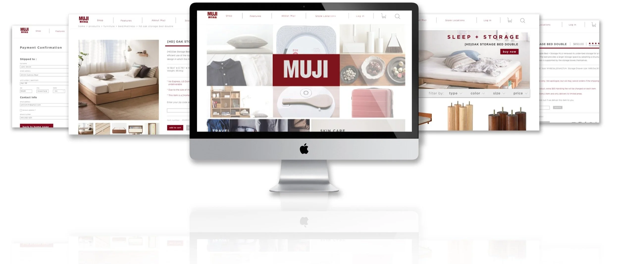
CATEGORY PAGE
• Grid style layout
• Large header with category image informing user page location
• Search results filters : price, user reviews, and product size Instant access to product categories
• Quick drop down for instant navigation
• Drop down banner containing product description, user rating, dimension, and price
PRODUCT DETAIL PAGE
Problem (Current)
The current design has a major flaw that notifies the user if an item is unavailable after scrolling 3 windows down . After inputting a zip code at the 3rd page, the users will then be notified if an item is unavailable for shipping.
Solution (New)
Within the 1st page, information regarding product description, price, dimensions, and shipping cost/information can all be viewed without scrolling. This allows the users to be aware of the availability of the product instead of out during the checkout process
The 2nd page has information on related products. The bottom half has no content on shipping/cost


Access category drop down anywhere
Find your products easier
Resolve Shipping
To simplify the availability search for shipping, users can input their location directly below the product description, and have the shipping cost immediately updated
User Research
Began with comparative and competitive research, understanding business goals, heuristic evaluations, targeted user persona/scenario, usability testing, insight gathering and formulation of solutions.

CARDSORTING
Organizing the products into categories required card sorting from several users. Testing the users with card sorting allowed us to identify which products belongs to which categories
Define the main criteria for organizing categories (furniture,tools, office, media, clothing, etc).
Define subcategories.
Identify in which subcategory to divide items.
Creating labels for categories, subcategories and items.
USER FLOW & CONCEPT IDEATION
Sketched out solutions to improving Muji's layout, information architecture and comparing current/new user flow
Exploring website page layout to simplify navigation for user
WIREFRAMING MID-FI
Wireframing research of product detail pages and checkout process to develop more effective and fluid pathways for users.
HOME -> DROP DOWN -> PRODUCT PAGE -> CATEGORIES -> PRODUCT DETAIL -> CHECKOUT OPTIONS -> PAYMENT