
Overview:
The Lumenus website design was a project for our client, Jeremy Wall, CEO of Lumenus Inc. Originally funded through Kickstarter, Lumenus produces wearable apparel that connects to your smartphone and lights up, creating a safer commute for cyclists and riders in dark traffic hours. Although their current Kickstarter campaign has been successful, the company has had a difficult time obtaining pre-orders from customers. I analyzed Lumenus's current website and noticed a lack of information about the product itself and the technology being used. By reevaluating Lumenus's value proposition, researching competitor products, and organizing the information architecture, I was able to deliver a seamless website that allowed for high conversion rates and an improved user experience.
Project Role: Lead UX|UI Designer
Company: General Assembly client project (Lumenus)
Time: Designed in 4 weeks
Tools: Whiteboard, Sketch App, user testing, user research, competitive analysis, wireframes
The Problem
Issues seen on current website
Users do not understand how their products work.
No clear value propositions on homepage
Not enough infographics.
Lack of navigation through each selling product.
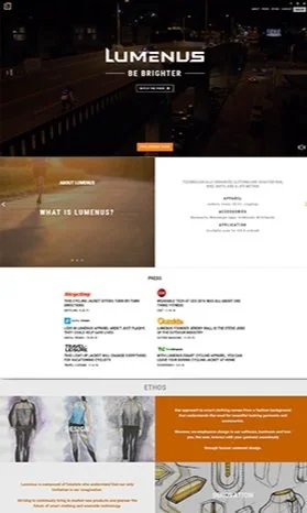
Original Website Home Page
The Solution
Realize more pre-orders by providing
Users do not understand how their products work.
No clear value propositions on homepage.
Not enough infographics.
Lack of navigation through each selling product.
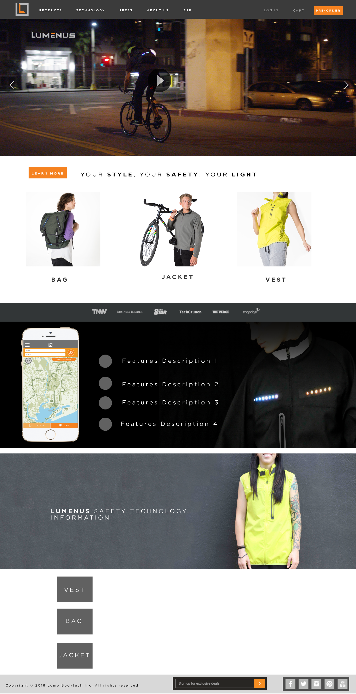
New Website Home Page
Part 1: Empathize
In the first stage of the Lumenus website redesign, my objective was to do a deeper dive into the type of consumers Lumenus was trying to attract. I wanted to better understand how they were attracted to product and some of current difficulties they were facing with checkout process
User Interviews
Being part of the Kickstarter community, Lumenus received valuable feedback from users, some of whom were offered a discount for future purchases. The survey highlighted a common theme of inadequate value propositions and product details on Lumenus's website compared to their Kickstarter page. Additionally, users preferred pledging on Kickstarter during the campaign instead of pre-ordering from Lumenus's website.

Emily 27 Occupation: Digital Marketer
"I need more than a Kickstarter page to invest; a clear value proposition and a solid plan for bringing the product to market are essential."

Mark, 32 Occupation: Software Engineer
"I need a website that provides clear and comprehensive information about the products. Without that, I'm hesitant to make a purchase."

Sophia, 30 Occupation: Fashion Designer
"Images sell designs better than words ever could….I want to view them all to make a purchase"
Part 2: Define
In this stage, I aimed to comprehend various user archetypes and identify the most suitable one for my interface. Accordingly, I crafted two primary user personas, brainstormed several app interfaces based on my target user, gathered survey feedback, and formulated four hypotheses based on it.
User Archetype
During this stage of my design process, I aimed to anticipate the behavior of users while using the site, recognizing that user behavior may change over time and thus require adjustments to archetypes.
It's important to note that archetypes provide a better foundation for informing UX design than user personas. While personas are fictional characters created to represent segments of your user base based on demographic details, they omit a critical aspect: behavior.

Tiffany Shu: Intermediary User
Employment: Tech Company
Age: 33
Location: San Francisco, CA
Goals: • Enhance the cycling experience with innovative products • Find products that offer safety features, such as lights or wearable technology.
User Behavior: Stay Healthy, Organized, Tech Savy
Tom Smith: Direct User
Employment: College Student
Age: 23
Location: New York, NY

Goals: • Purchase expensive items on desktop • Stay educated in tech products • Inspired by innovation
User Behavior: Power user, Organized, Atheltic
Part 3: Brainstorming
After collecting information from the survey, I began sketching ideas centered around a Layer Cake design. My objective was to emphasize the information users would want to see before scrolling down the page, such as the value proposition and a compelling product image. I added relevant sections further down the page to address users' needs.


Questions I asked myself
What should the user see first on landing page?
How can I stream link the checkout process?
What types of infographics should users see?
How should I organize my site mapping?
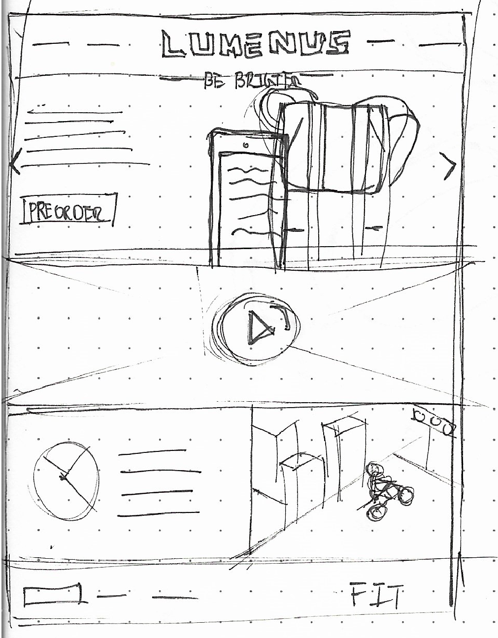
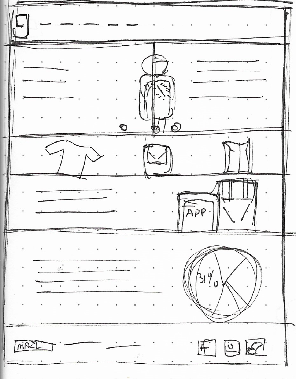
Part 4: Low-Mid Fi Wireframes / Testing
The design team of Lumenus was generous enough to supply high-quality pictures and graphics from their Kickstarter page, which were utilized for the low-to-medium fidelity user testing. As the existing Lumenus website already had its distinct design language, I preferred not to make significant alterations to it. Instead of reinventing the wheel, I usedthe Sketch App and superimposed images onto the call-to-action sections before carrying out user testing.
Moderated User Test
1) Learn more about Flash Bags and learn how they work
2) View details of Flash Bags
3) Purchase item and go through checkout process
User Questions
Regarding user experience, which part of the website do you think you would use the most? What is the reason behind your choice?
How would you describe your overall experience with the website so far?
If you had to make one modification to the website, what would it be, and what is the reason for that change?
Were you able to learn about the company and the products it offers?
Interpreting the Results
Re-Organizing Focal Section
Overall functionality of the website was received well, however users did not understand what the website was selling. Thus adjusting the sections was needed to create a simple understanding of what Lumenus products were about.

Detailed “How it Works”
Having a detailed “ethos” about Lumenus was not a necessity for the How it Works page. Users wanted more detailed information and infographics capturing the products core features
Checkout Process
During the checkout process, users expressed their concern that the product and checkout page appeared too bland, and failed to instill confidence in purchasing the Flash Bag. Users expressed a desire to see the product being showcased as a lifestyle item, as well as access to a specification sheet.
Final Wireframe Design
Navigation
Categories for navigation link : Products, How it Works, What People Are Saying, Log in, Cart, Pre-Order.
Value Proposition
Visible text explaining users what the product is, who its for, and how it works.
High contrast CTA's to explore products and see how to products work in detail.
Background image of a cyclist using the product in a environment .
Hero shot of Lumenus bag being used with mobile app.
Announcing $75 off for pre-order online customers below value proposition.
Product Section
Image of products available .
CTA's to learn more about the product.
How It Works
Infographics and description of how Lumenus gear works with mobile app. (Gear + App = Safety).
Product Features
Category
The product page displays all current Lumenus gear in one page. The design of the page was meant to show Lumenus not only as a tech product, but also be portrayed as a fashion brand. A neutral light gray sectioned background gives a strong contrast with the product images and the bold dark text, informs users, a short description of each product. A darker gray CTA allows customers to learn more of each gear.
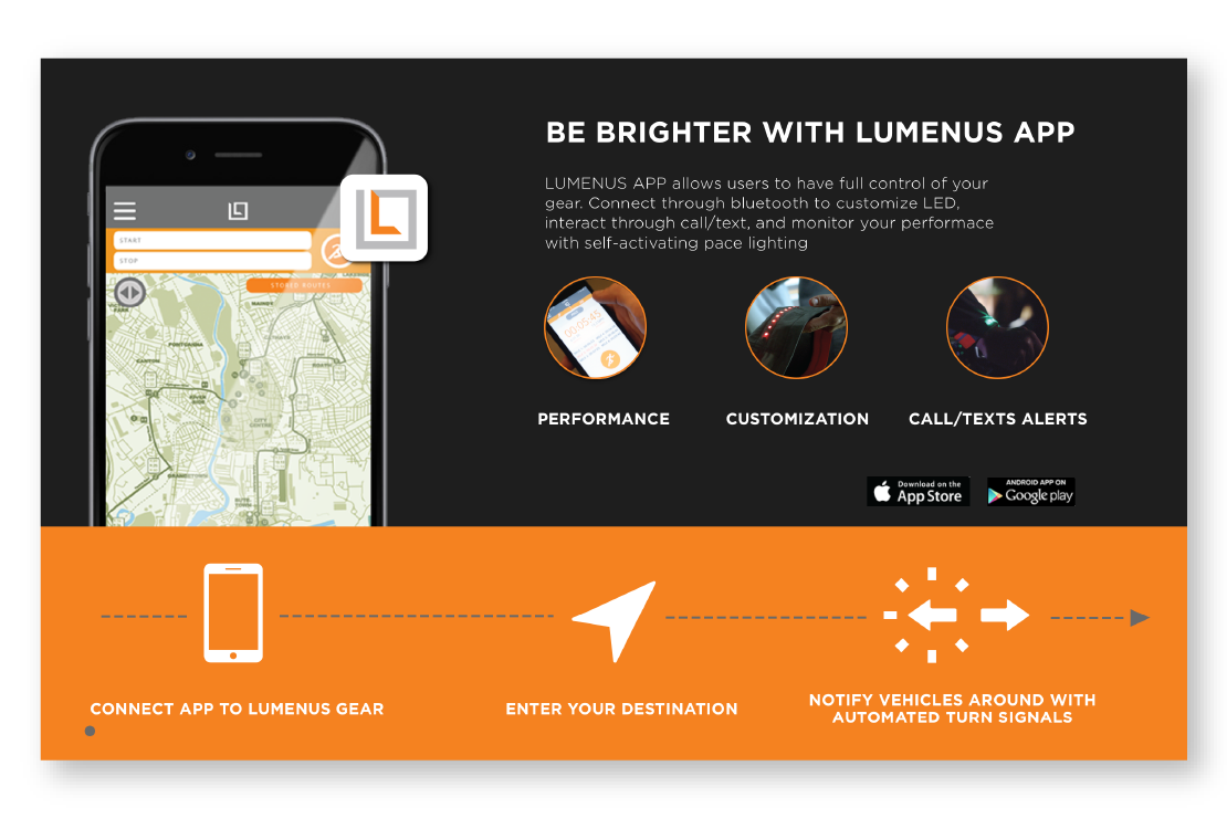
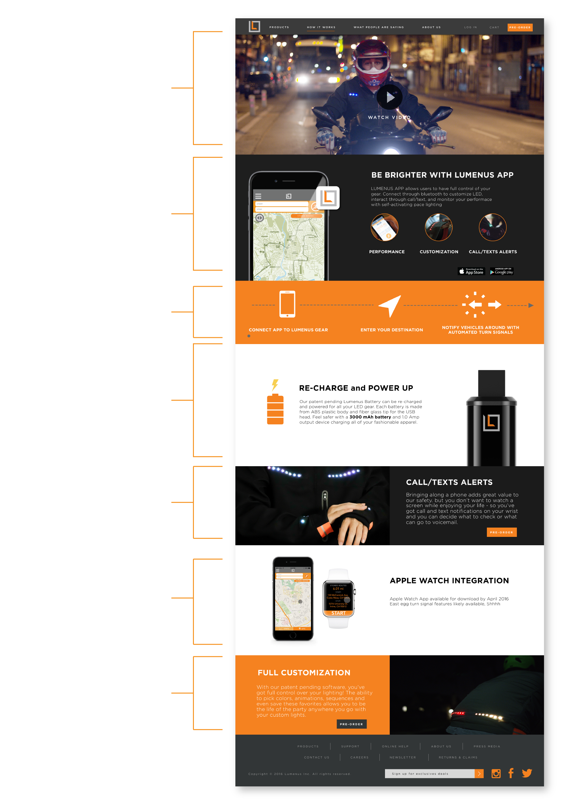
How it Works Page
Technology
One of the largest issues we found based on user testing the original Lumenus website, was the question of "how does the product work"? In order to resolve the problem, I designed the page to explain the steps by creating a Layer Cake layout. Each section is an explanation of how each feature is used with Lumenus's gear. User will be able to better understand the technology by scrolling down the list and view infographics/information regarding its feature.
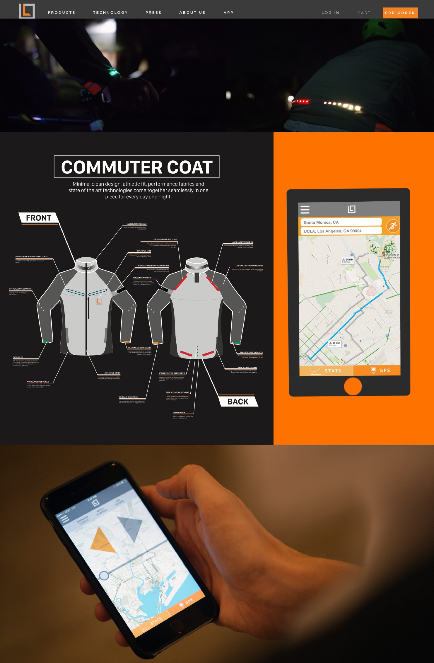
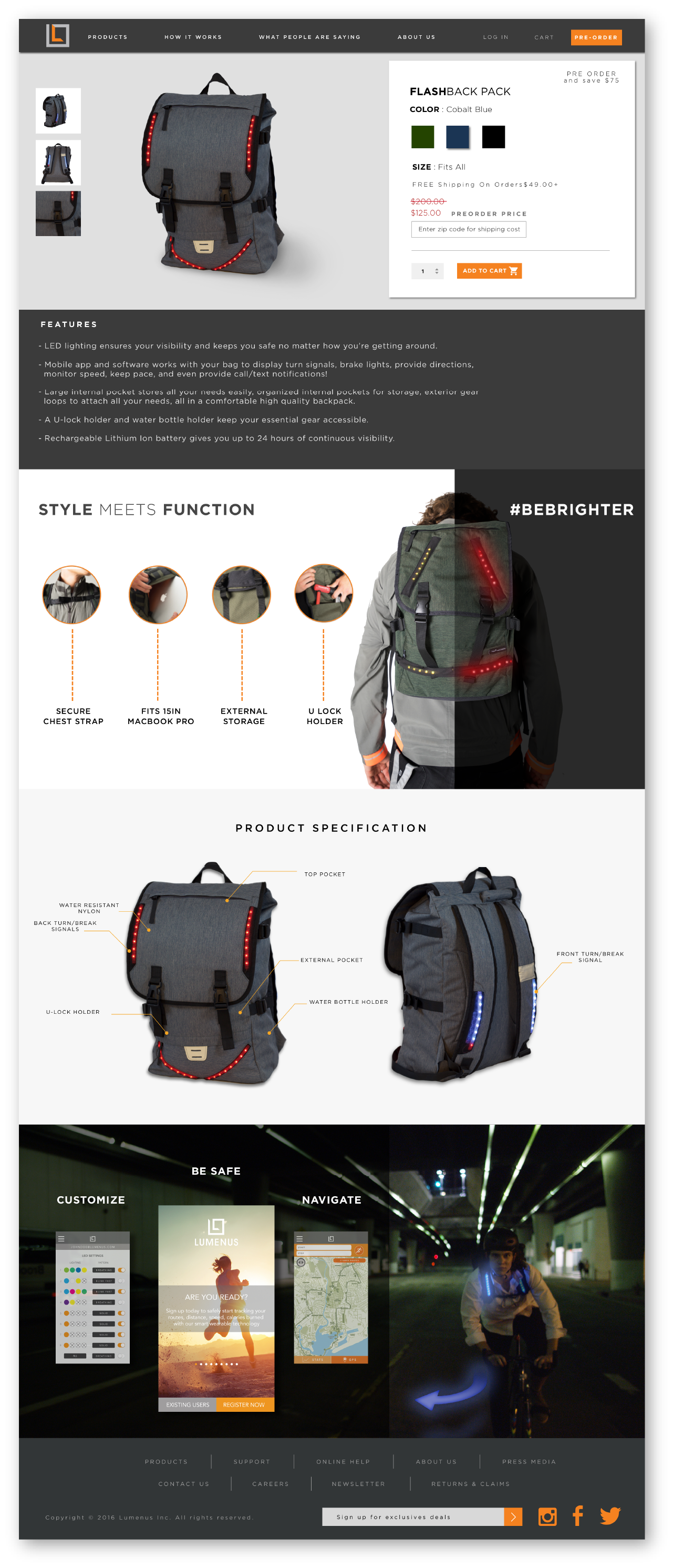
Product Detail Page
To gain more pre-order sales and give users an easier checkout process, we designed the product detail page and add to cart feature within the same section. Users can now pick their quantity and color, and have the total price discounted, automatically, by pre-order. By scrolling down through the page, users can better understand the product by looking at stylistic images of features, specifications, and screenshots of the app used.


More Information. Less Clutter
Detailed description bullet points for product.
Highlighted images with feature callouts.
Night/day environment hero image of product.
Product specification section showing both sides of product.
Automatic discount price adjustment for pre-order sale.
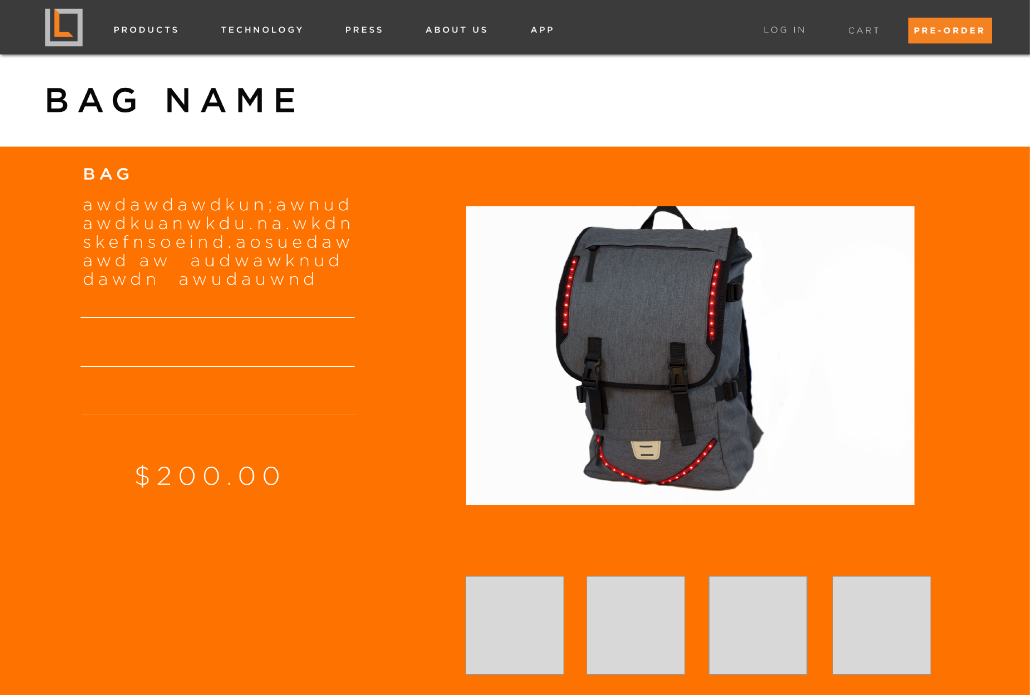
Checkout Page


Conclusion
The CEO highly valued the website redesign and research findings, which enabled the developers to enhance the current site using wireframes and updated information. Nevertheless, the company decided to shift its focus to a different business line and update its product offerings.
From this project, I realized that it would have been beneficial to document the user testing more thoroughly and allocate more time to research conversion rates from crowdsourcing sites to operational sites generating revenue. With this knowledge, I am confident that the next website redesign will incorporate more data to provide a smooth user experience.